
Casa Comfort
—
Casa Comfort is a furniture store located in Catania that deals in the sale of kitchens, bedrooms and mattresses. It deals with the resale of brands attentive to design at a price open to all. It caters to a medium/low clientele, used to buying in large stores such as Ikea. The brands handled by Casa Comfort are positioned between Ikea and Flou.
Concept
—
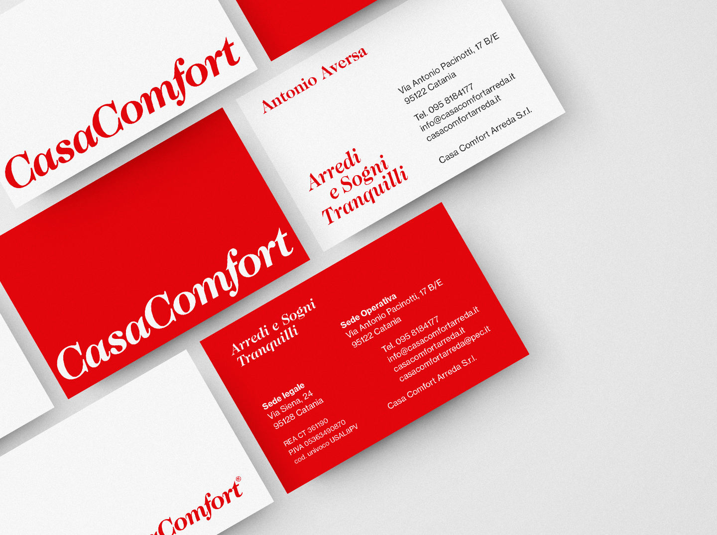
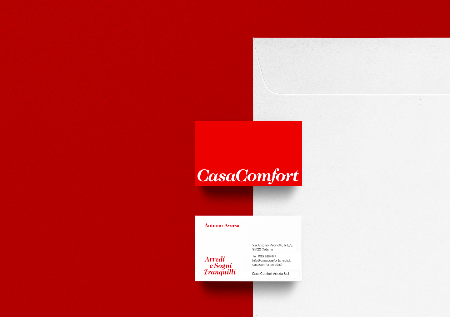
The client asked us to create the brand, visual identity, promotional brochures, posters, ADV and to take care of social management.
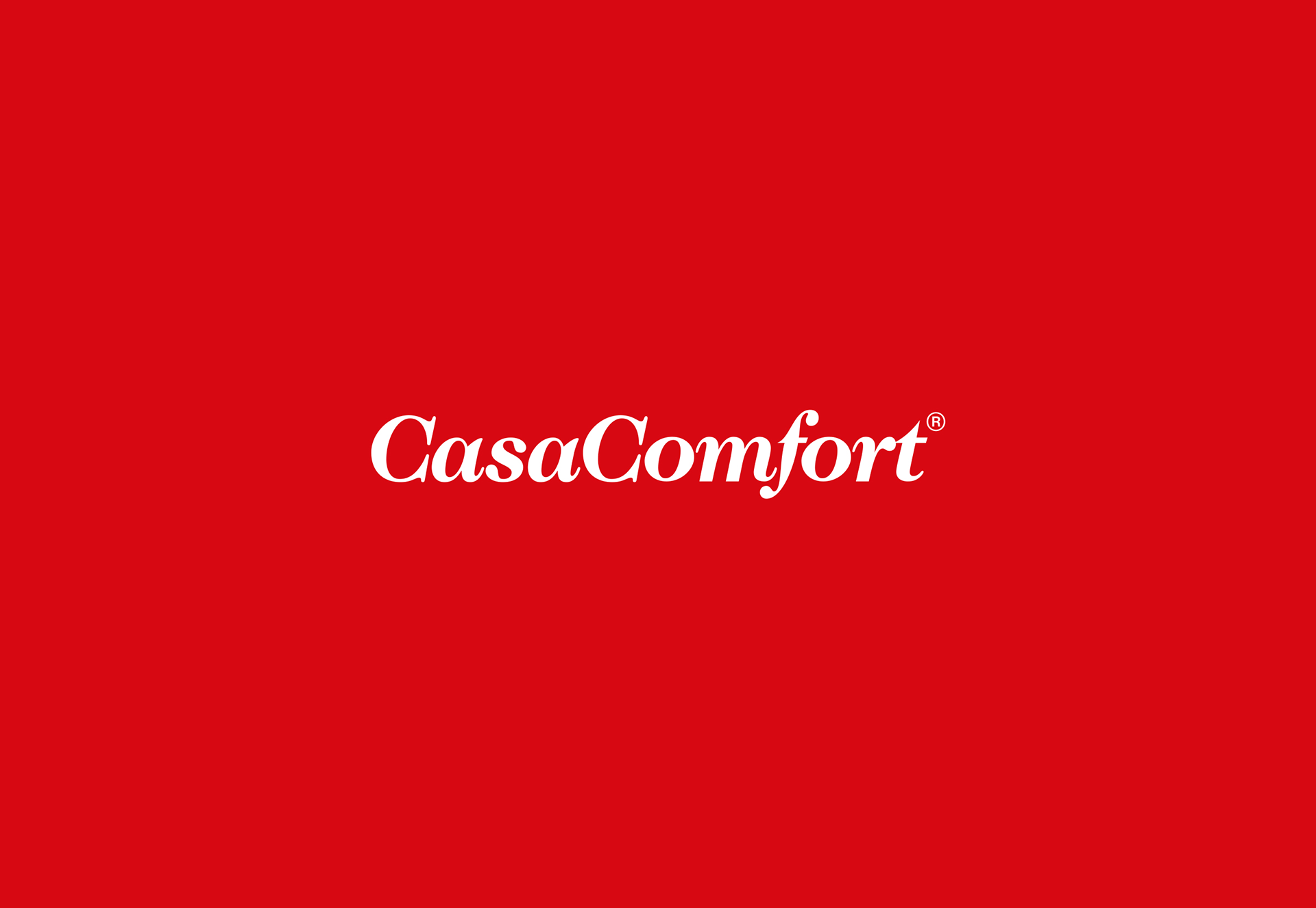
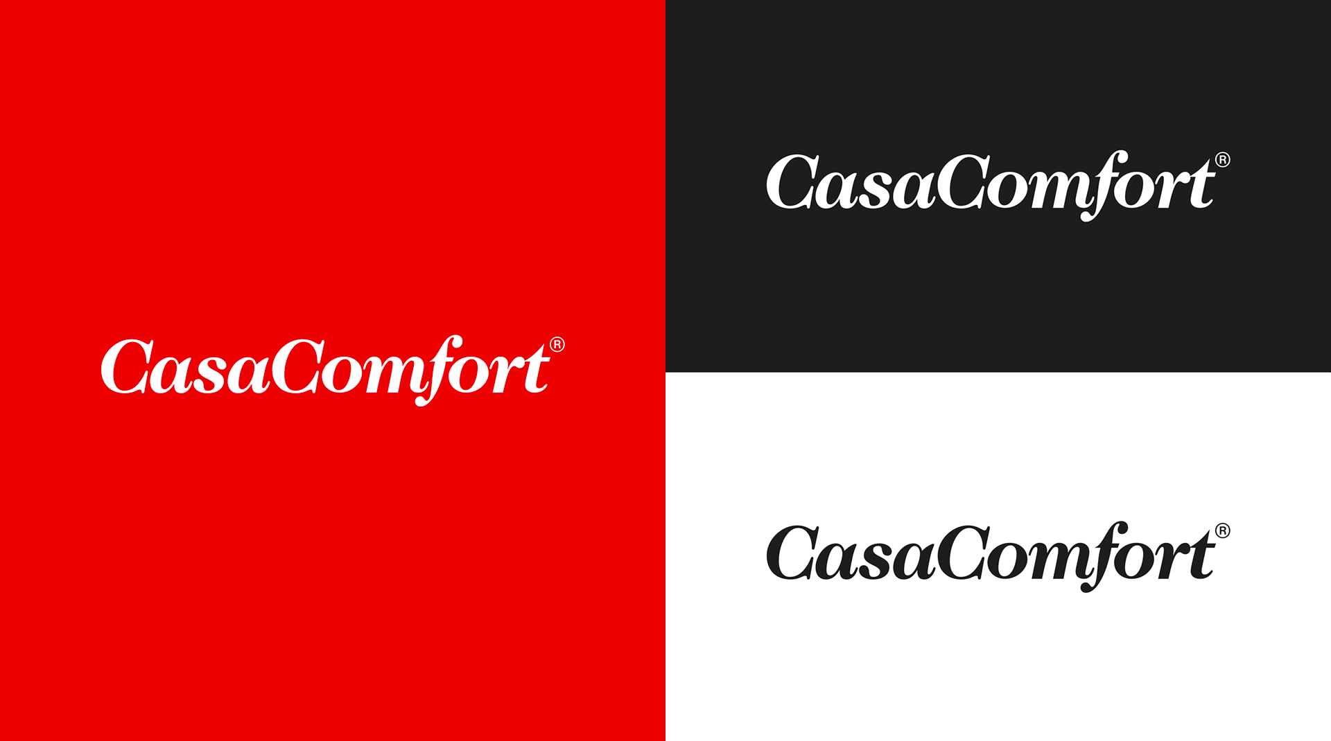
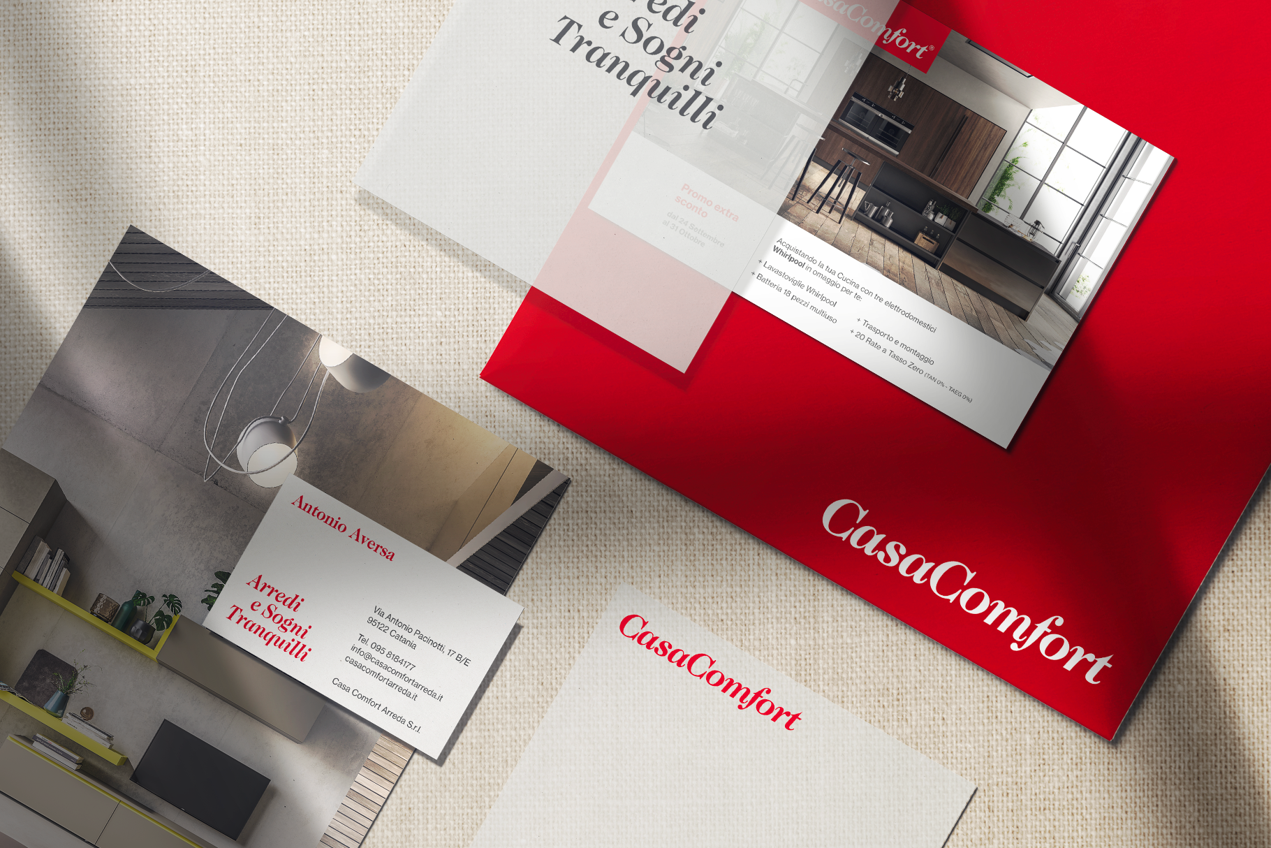
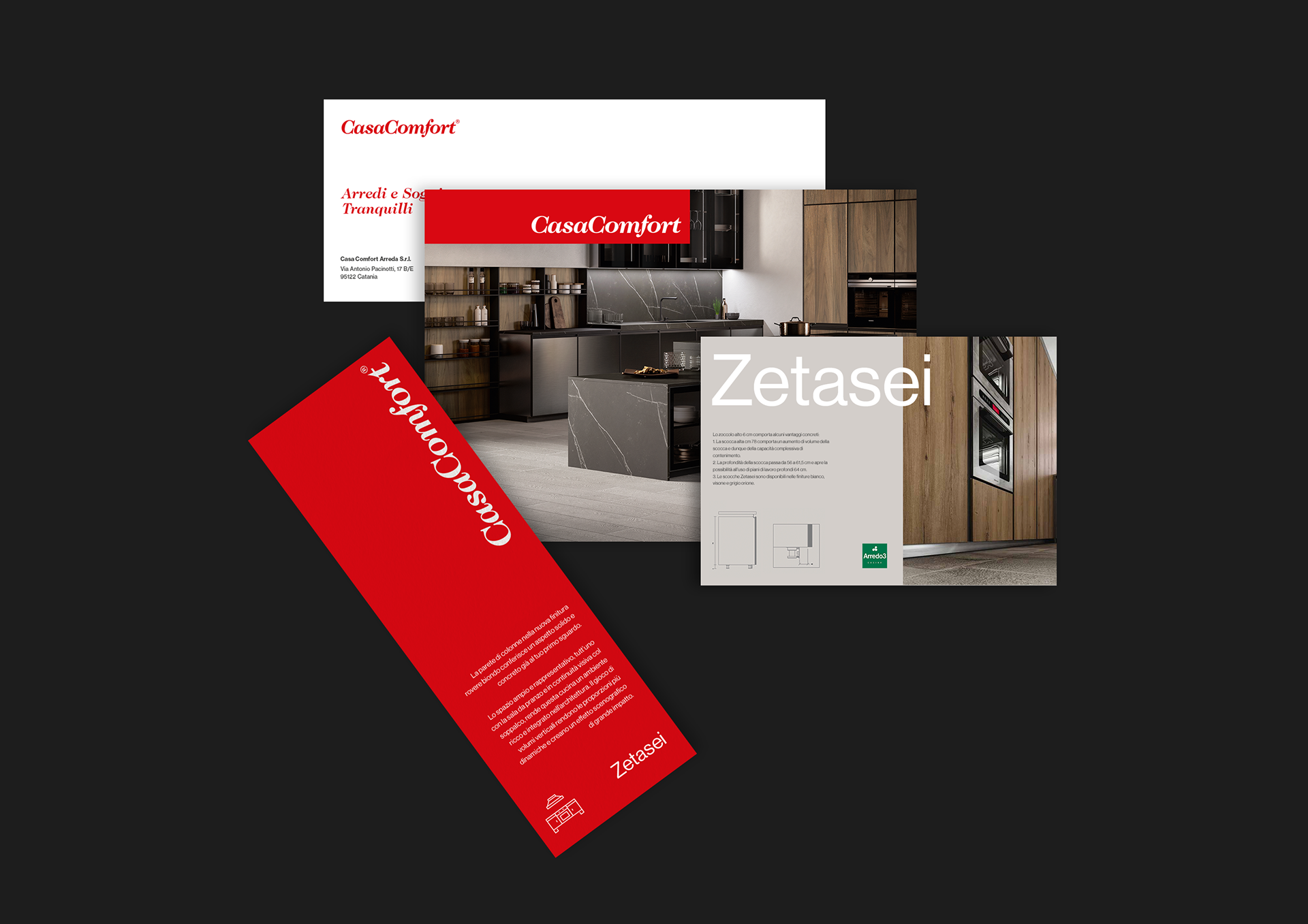
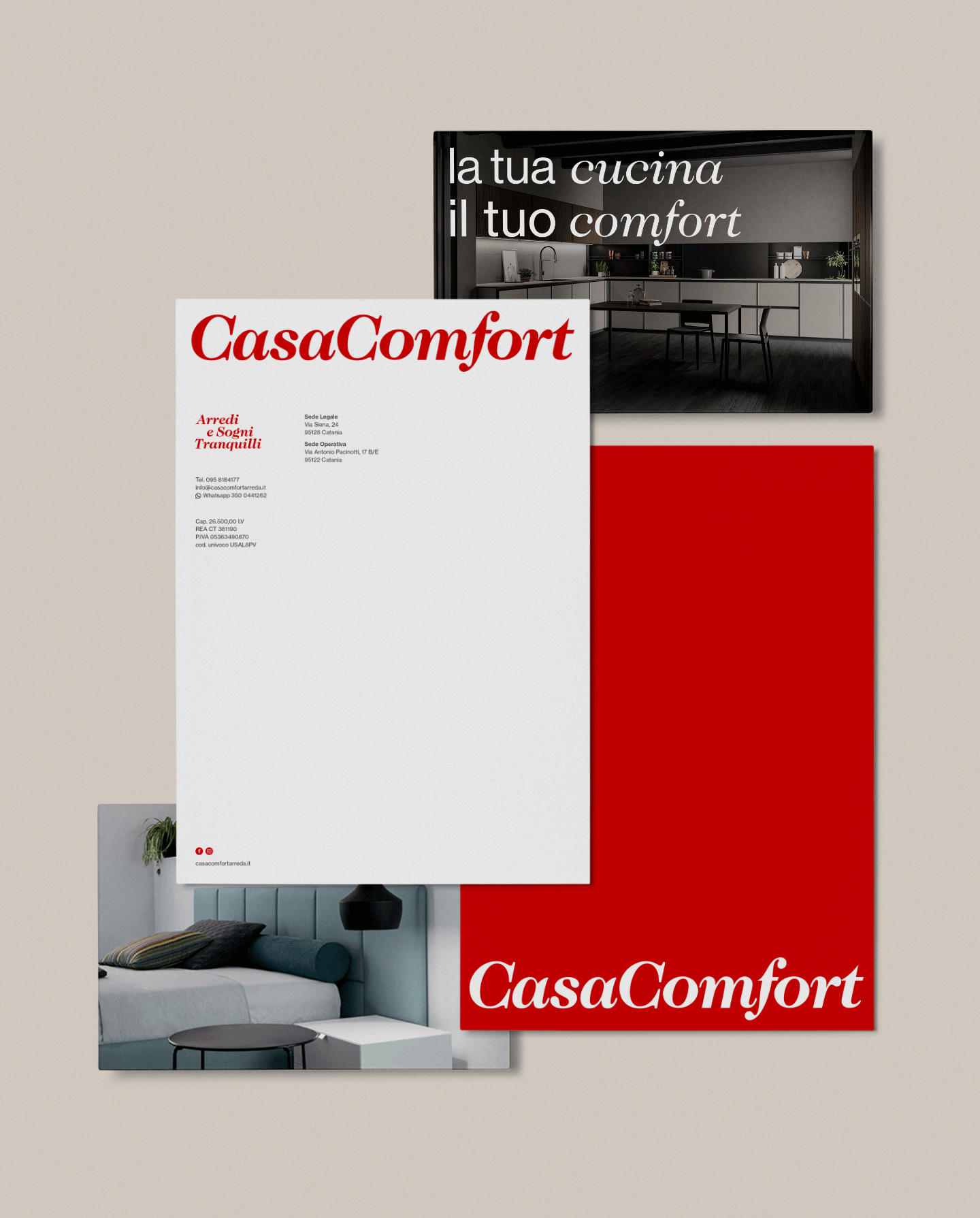
We wanted to design a brand that expressed elegance and design, without symbols, a simple logotype capable of adapting to any use. We composed the lettering "Casa Comfort" in ITC Caslon 224 Bold. We did not like the space between the two words, so we eliminated this space by using only the two capital "C" as a separation.
01. Logotype
02. Color Palette
—
The client expressed to us his desire to have a visual in which red was predominant. We accommodated his request well, for red is a color that is often used in furniture branding. We chose a red that could fit both print and digital, using it along with some shades of gray throughout the visual identity.

03. Visual Identity
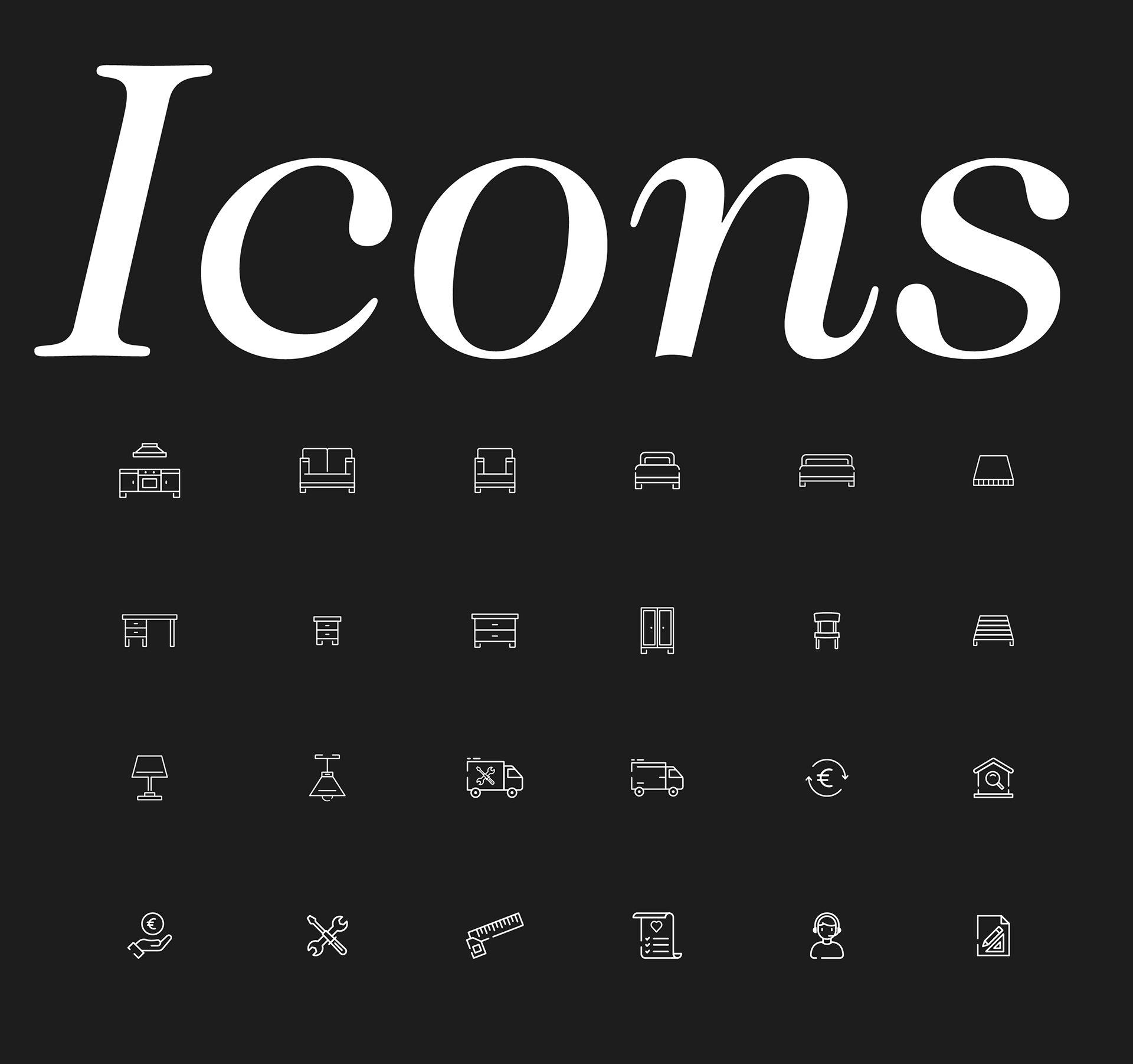
04. Icons
—
We designed a set of custom icons that could be used within the visual identity and website.


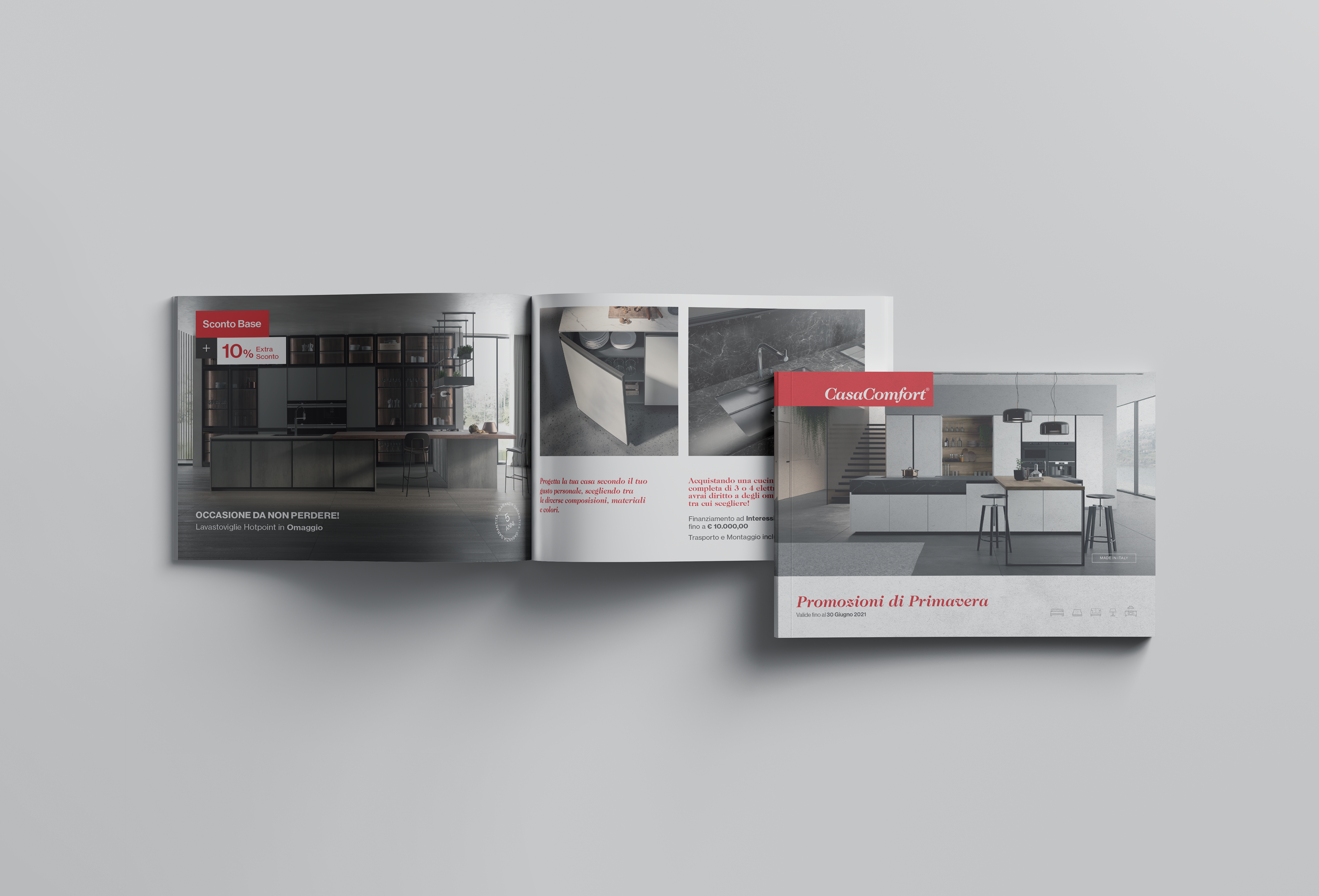
05. Brochure

06. Billboard

07. Signage
—
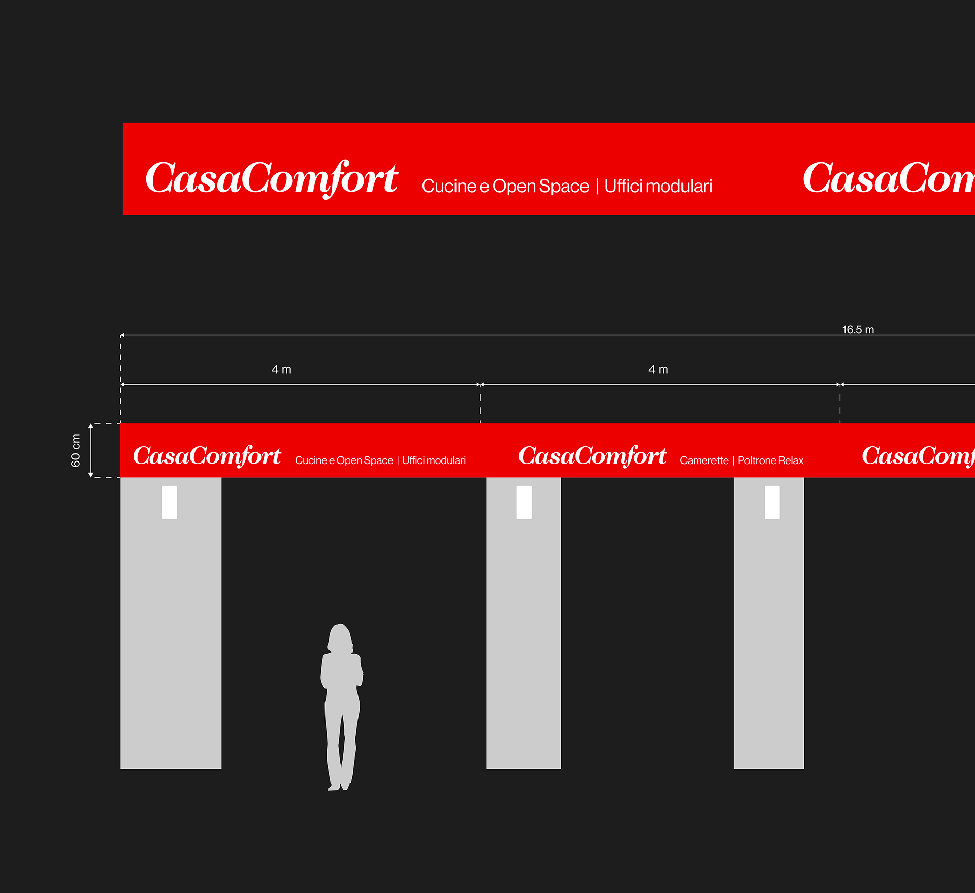
The client commissioned us to design the store sign. The store faces the street, and it is separated from the street by a space of about three meters. Since it is a main road, a large number of vehicles circulate daily from it. The signage had to be as long as the length of the facade, 16.5 meters, while the height space available was only 60 centimeters. We designed the signage so that the logo would repeat every 4 meters, so that it would be clearly visible to moving cars. Between each logotype, we placed the products handled by the company so as not to leave too much empty space. For the realization, we were inspired by theories reserved for the design of signage in subways around the world, in which the name of a station is repeated several times so that it is clearly visible to passengers above the moving train.

Thank you for watching!